What needed to change.
The existing visual language had energy, but it changed from channel to channel and made the brand feel less established than the business behind it.
Turning the view

The project in one minute
The existing visual language had energy, but it changed from channel to channel and made the brand feel less established than the business behind it.
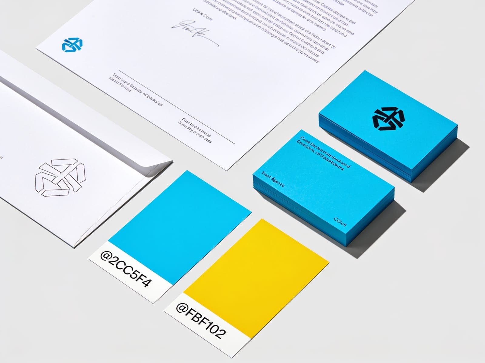
We reduced the system to a clear set of recognizable assets, then tested them across stationery, presentations, social formats, and digital touchpoints.
A flexible identity with enough personality to stand out and enough discipline to stay consistent as the brand grows.
 01
01 02
02 03
0304The disciplines
05Keep exploring
Build the next case
Project request
Tell us what you are trying to build. We will review the context from this page and respond with a practical next step.